Hand-lettering on 9"x12" Bristol board. Scanned and colored. Minimal cleanup in Photoshop.
'You Missed Your Numbers!' [Illustration]
An illustration created with the 'Paper' app on iPad. I used the Fountain Pen brush for the main strokes, then used the Magic marker and Pencil brushes for some detail work. I used a More/Real Sharpie stylus cap, which gives a more natural drawing feel.
The Five Basic Tools of 'Paper'
I fell in love with the 'Paper' app when it was first released. It's a very stripped down, simple app. You have a simple set of 5 tools and a basic, muted color palette. That's it. The tools are in a handy 'drawer' that slides down, out of your way, to let you get down to business. You can organize your drawing in 'notebooks' that mimic Moleskine journals. You can add/delete pages and move them from one journal to the other. The best part (for me) is the ability to share drawings via email, Tumblr or Twitter, or just save to Camera Roll.
'Paper' is great for loose illustrations and diagrams. It has no layers, filters, import or color correction and you can't change the color palette. But that's kind of the point - keep the tools out of the way and get your ideas on paper. If you're looking for something more robust for the iPad, I'd suggest Procreate.
'San Francisco' Script Lettering
Thinking about travel destinations. A quick sketch done in my Moleskine 5.25" x 8.25" unlined sketch book. Inked with Staedtler 01 and 07 pigment inks.
'Fearless' Hand-Lettered Logo
Hand-lettered on vellum paper, scanned then redrawn in Illustrator. Shadows and background texture created in Photoshop.
Get Your Shit Together!
Today was one of those days where I felt a bit...unsettled. There was no obvious root cause, and (knock on wood) there's nothing too earth-shattering occurring in my life right now. All in all, compared to what I went through a few years back (cancer diagnosis combined with economic chaos), things are downright peachy on this end. But as of late, I've felt this internal nagging to 'tighten things up'.
I should recognize that I usually get this feeling when the seasons change. This is especially true as we transition from August (everyone is either on vacation or mentally checked out) to September (back to school, back to work).
So, as I'm sketching this morning, the mantra 'GET YOUR SHIT TOGETHER' entered my brain. The sketch was done quickly. I spent the rest of the day GMST (Getting My Shit Together®) and then revisited it tonight with this tracing in Illustrator.
'Make Excuses or Make Money' Lettering Study
Another lettering project with a phrase captured in the sketchbook from an unknown source. I'm sure this phrase was born from some podcast or book or blog post dealing with time management or procrastination and I felt the need to capture it, because it's so spot-on. Making excuses just takes away from time you could be doing. There is no try, only do. I sketched the letters quickly with a loose set of characters, then took a photo of the sketch. This saves tons of time when your're tracing the sketch in Illustrator and not cleaning up lines in Photoshop.
I shot the sketch at my drawing table with my iPhone, and since I had Photo Stream turned on, the sketch was already in iPhoto when I was ready to start tracing. I simply pulled the photo from iPhoto into Photoshop, cropped and resized (to make the file smaller) and then dropped the photo into Illustrator. I locked the photo onto it's own layer, set up a new layer for lines and begin tracing.
Since I used a very loose (and not very detailed) style of lettering, the tracing went very quickly. I only made a few modifications from the original sketch, capitalizing the letter 'A' throughout and the 'E' in 'Money'. I colored the letters in Illustrator until I got just the right color combo. This color selection was pretty much arbitrary, but I liked it. Obvious choices of shades of green just weren't working for me.
I then dragged the grouped letters into Photoshop as a Smart Object. This way I can compose a high resolution file and backgorund in Photoshop and then export to whatever size I need. I also still have the separate file of the the traced letters to repurpose or use on another size document.
'Mod Zone' Lettering Study
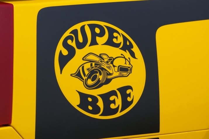
The phrase 'Mod Zone' somehow made it into my sketchbook a few weeks ago. I thought at first the influence was from the old Dodge 'Super Bee' logo, but the only things similar are the curved letterforms within a circle:
I made a quick inking of the letters, then scanned them into Photoshop. I didn't spend much time on cleanup, since I knew I was just going to trace the scan in Illustrator. Once the letter outlines were complete, I placed them within the circle, then adjusted the shapes of the letters to conform to the outline of the circle. As for colors, this selection was random. I didn't want to get too hung up on gradients and textures, but rather focus on the shapes of the letters.
Once the lettering was complete in Illustrator, I opened up a doc in Photoshop, created the background and added a subtle texture. I dropped the lettering in as a smart object, resized, added a slight shadow, and called it a day. I could have spent a lot more time tweaking, but I'm thinking I'd rather just crank out a bunch of these studies to work on technique.


