
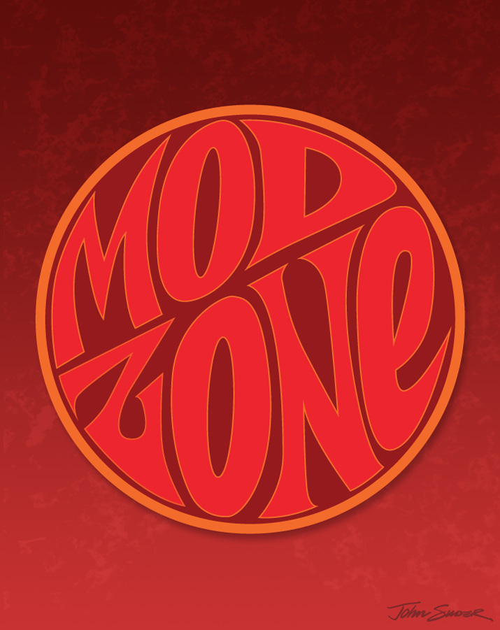
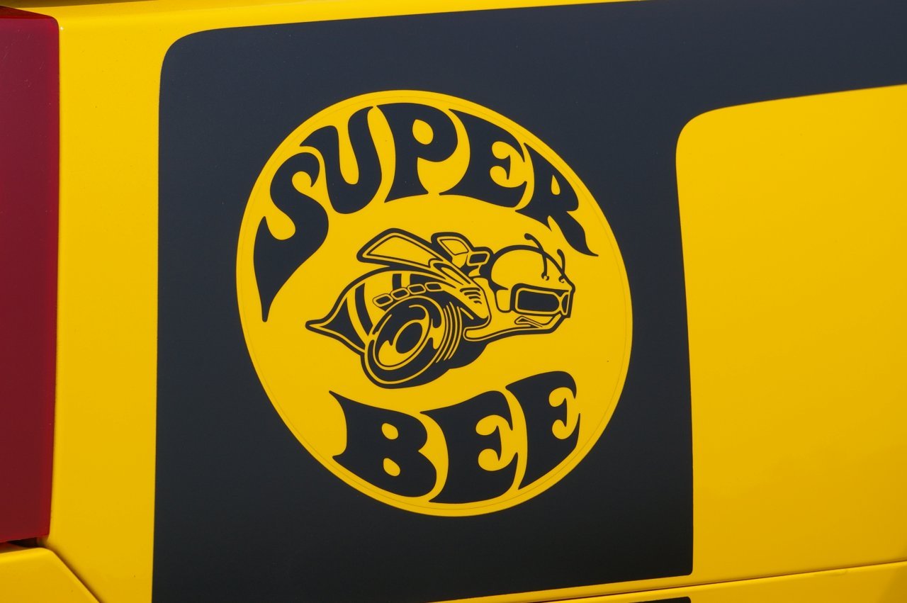
The phrase 'Mod Zone' somehow made it into my sketchbook a few weeks ago. I thought at first the influence was from the old Dodge 'Super Bee' logo, but the only things similar are the curved letterforms within a circle:
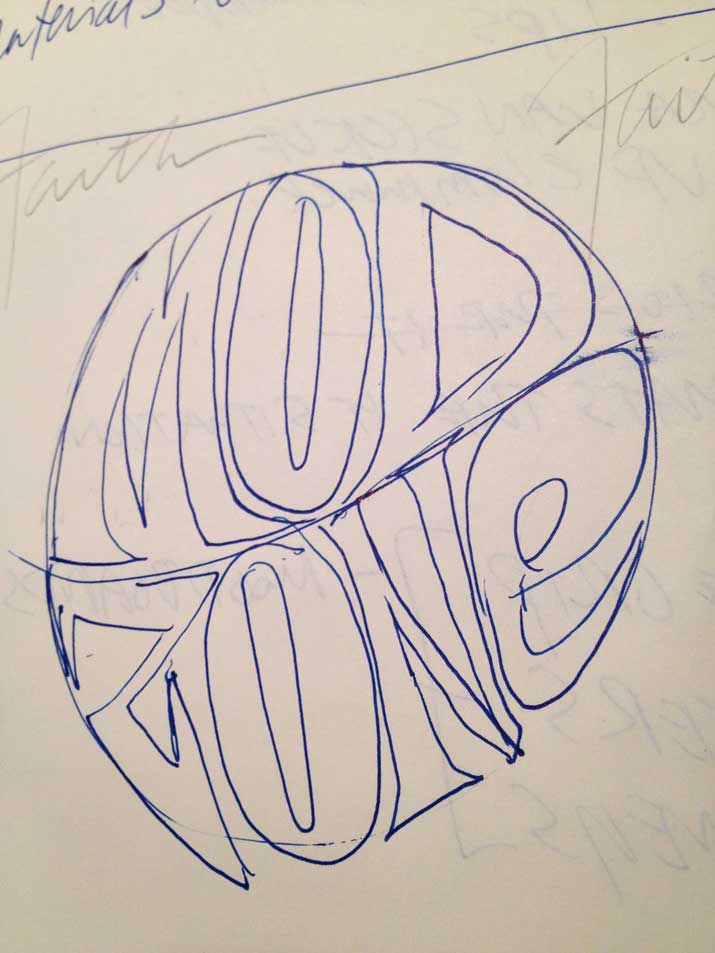
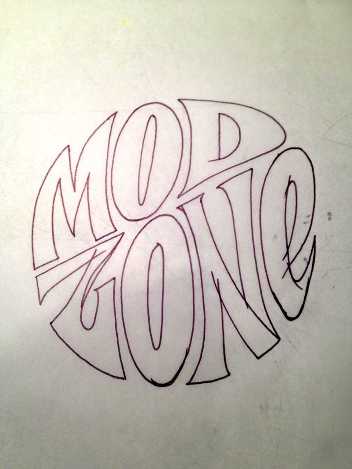
I made a quick inking of the letters, then scanned them into Photoshop. I didn't spend much time on cleanup, since I knew I was just going to trace the scan in Illustrator. Once the letter outlines were complete, I placed them within the circle, then adjusted the shapes of the letters to conform to the outline of the circle. As for colors, this selection was random. I didn't want to get too hung up on gradients and textures, but rather focus on the shapes of the letters.
Once the lettering was complete in Illustrator, I opened up a doc in Photoshop, created the background and added a subtle texture. I dropped the lettering in as a smart object, resized, added a slight shadow, and called it a day. I could have spent a lot more time tweaking, but I'm thinking I'd rather just crank out a bunch of these studies to work on technique.